06 Styling Scheme
How can a styling scheme help with consistency in web design?
Vocabulary
self closing tag, utility classes, box model, media query, responsive, design language
Study Questions
- What is the benefit of creating and using utility classes in css for our projects?
- What do we mean when we talk of a styling scheme for the webpage or an application?
- How does the box-model work in css?
- What is the purpose of media queries in css?
- What is css flexbox and what can it do for our website?
- What is responsive web design?
- Why might we want a design language for our applications or web pages?
Activity
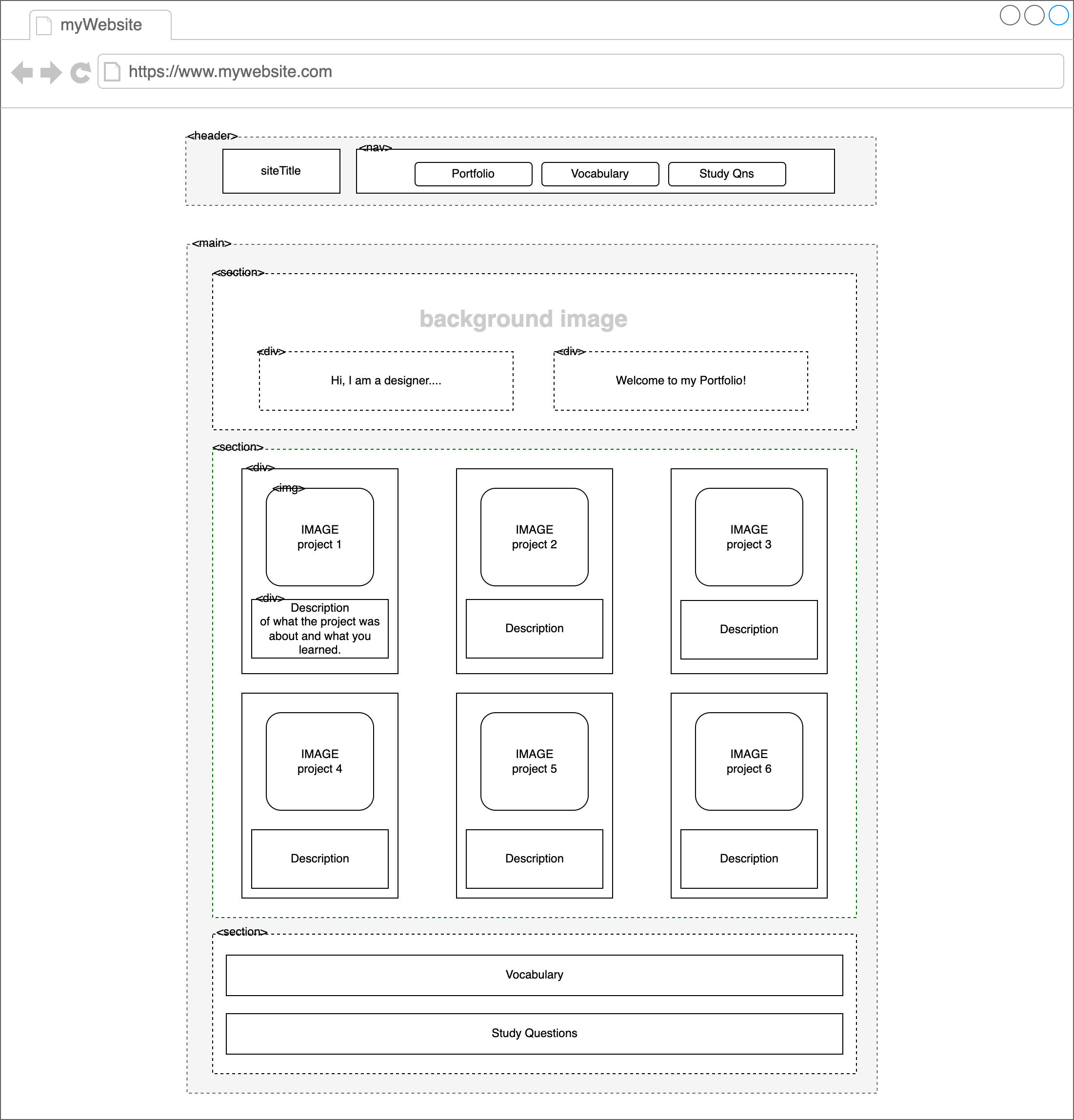
Watch Video #1 (below)- Build a project gallery of your first six projects. Follow the layout example below. Use snipping tool in windows to take screenshots of your projects’ outputs from lessons 01-06. You will have to pay attention to image size for consistently sized information cards.
- Create and use utility classes in css. Clearly group similar classes and highlight with comments. For example, css for margin sizes, background colors, text colors, flexbox etc.
- Make your website responsive (meaning it should scale to a different size and adjust its content to the best style for that screen size) using flexbox and media queries.
- Answer the vocabulary and study questions from this lesson. All descriptions must be in your own words and relevant in regards to our class.
- Spend time personalizing your webpage as you have explored more CSS properties. You are expected to go beyond borders and spacing. Think about readibility of text that you include in the page. Think about use of whitespace to enhance the outlook of your page.
- Remember to use camelCase for any multi-word names. Also, choose names of custom classes and functions so they indicate their use or purpose at a glance.
- Use comments to label the different html components of your website.
Resources
Video: 06 Grayscale Accents- Video: HTML in 100 seconds
- Video: CSS in 100 seconds
- Video CSS FLEXBOX in 100 seconds
- Interactive Tutorial: Flexbox Froggy
- Link: Color Palette
- Link: HtmlColorCodes
- Link: Design Language - Material Design
- Link: Design Language - Microsoft Windows App Design
- Link: Design Language - Apple Designing for iOS